I think project management can be compared to flying an airplane: there are many external and internal factors, all of them important and constantly changing, and each one must be taken into account. To quickly analyze the situation and make the right decisions, you need good tools and skills. Today, I want to share one such tool for project managers.
The first time I heard about Actionable Agile was two years ago from Paweł Słowikowski and Tomasz Feliksik during the first edition of Pyry na Wolności. I immediately fell in love with the elegance of the idea, and since then, have been promoting this concept with everyone interested in management.
The core idea is simple yet powerful: by analyzing historical data on how long tasks took in the past, we can statistically forecast how long it will take to complete a project or reach the next milestone. Without estimating every single task in the backlog or creating a Gantt chart, a project manager can still gauge the likelihood of finishing the project on time.
To keep things practical, I’ll skip most of the theoretical background and focus on how managers can use this approach in their day-to-day work to improve confidence and predictability in team performance. First, let me explain what is it and how to use it and then we’ll talk why it works.
Let’s consider a typical project: it consists of multiple tasks, and each task exists in one of three states: Backlog, In Progress, or Completed.
The idea is to treat work as a system that processes tasks over time and through states such as Backlog, In Progress, and Completed. By doing so, we can apply a few key metrics to better understand team performance.
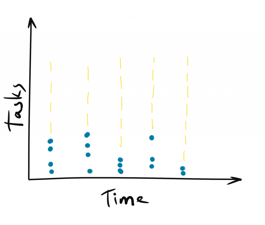
Let’s generate random tasks and some assumptions of their completing during a specific period of time.
| Description | Date Backlog | Days in Backlog | Date In Progress | Days In Progress | Date Completed | Total Days |
|---|
Now, let me show you a few visual representations that help us understand what’s going on with team and maybe, even highlight some potential problems.
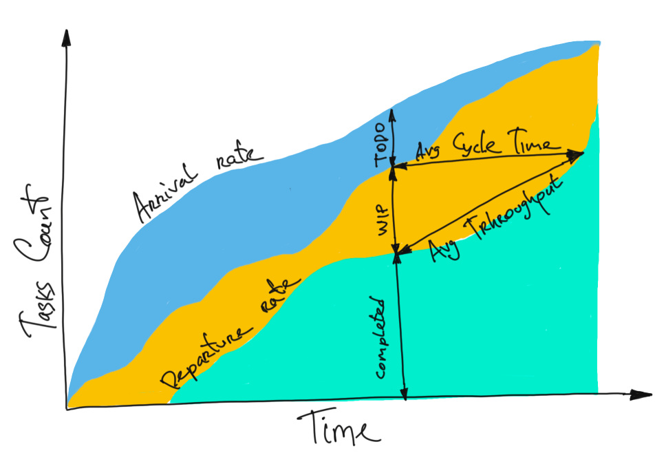
The first one is the Cumulative Flow Diagram (CFD)
A CFD shows the number of tasks in each state, Backlog, In Progress, and Completed throughout the project’s timeline. The slope of the Completed line reflects changes in team performance. I become particularly concerned when this line flattens, as it often indicates that something is blocking the team.
Now, let me introduce a few key metrics to evaluate our team’s performance based on this input:
- Cycle Time: how long it takes to complete a task, i.e., how many days a task remains in progress
- Throughput: how many tasks are completed over a given time period, such as during a sprint
- Work in Progress (WIP): how many tasks are actively being worked on at any given point in the project lifecycle
- Arrival rate: the slope of the To Do layer, representing how quickly new tasks are being added.
- Departure rate: the amount of work completed over a given period; essentially, a metric of team performance.
The height of the In Progress area represents the team’s Work in Progress (WIP), how many tasks are being handled at any moment. Disproportionate changes in WIP often signal problems. I always want to ensure that steps are being taken to mitigate such issues. When the Backlog area begins to outgrow the In Progress area, it usually suggests that a manager or product owner is overestimating the team’s capacity and assigning more work than the team can handle.
The manager’s goal should be to maximize throughput by keeping WIP at an optimal level. Taking on more tasks than the team can handle reduces output and slows the team down.
The width of the In Progress band on the CFD reflects the Cycle Time, represents how long it takes to complete a task after work begins. Calculating the average Cycle Time helps estimate how long it typically takes the team to finish a task.
The angles of arrival and departure rates show how quickly tasks are coming to the team and how fast the team completes them.
Below is an explanation of how to identify these metrics on the chart:
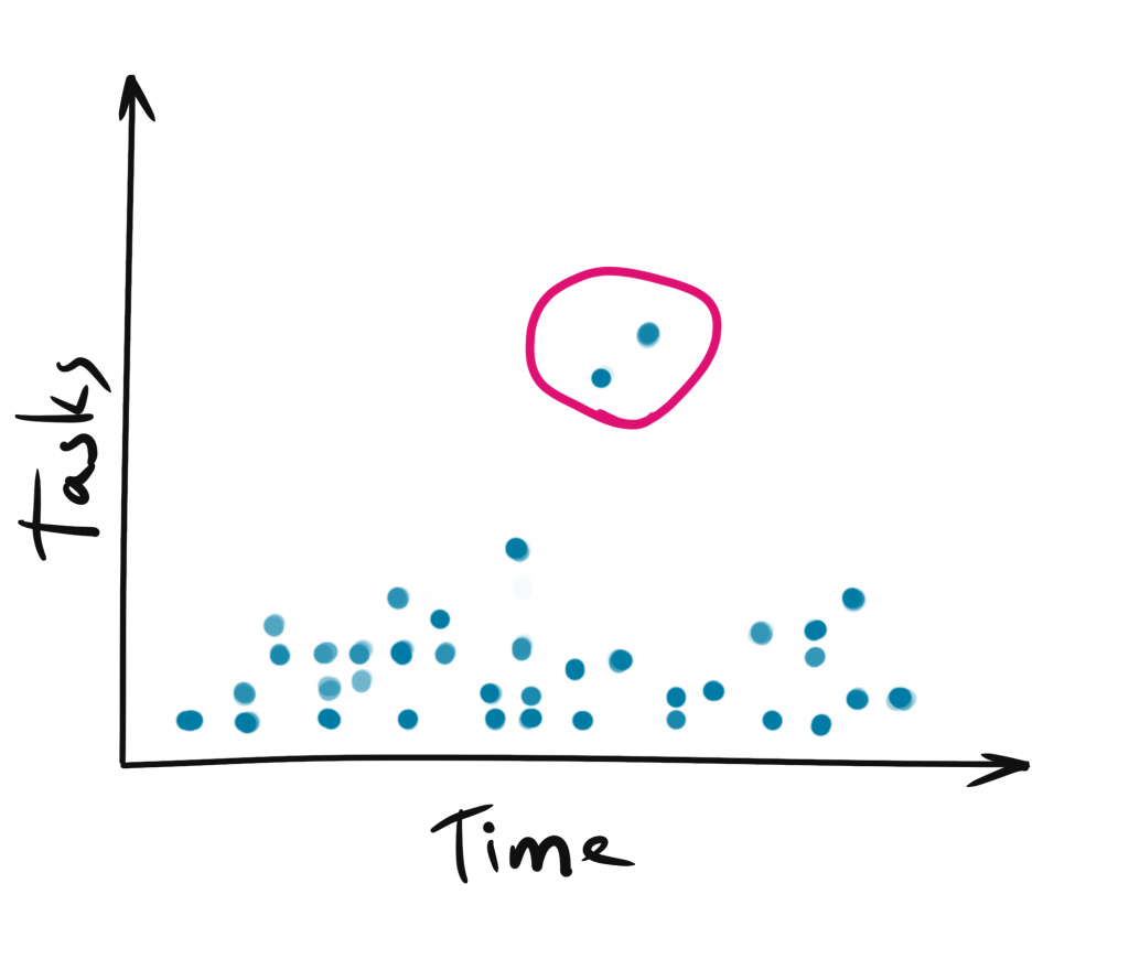
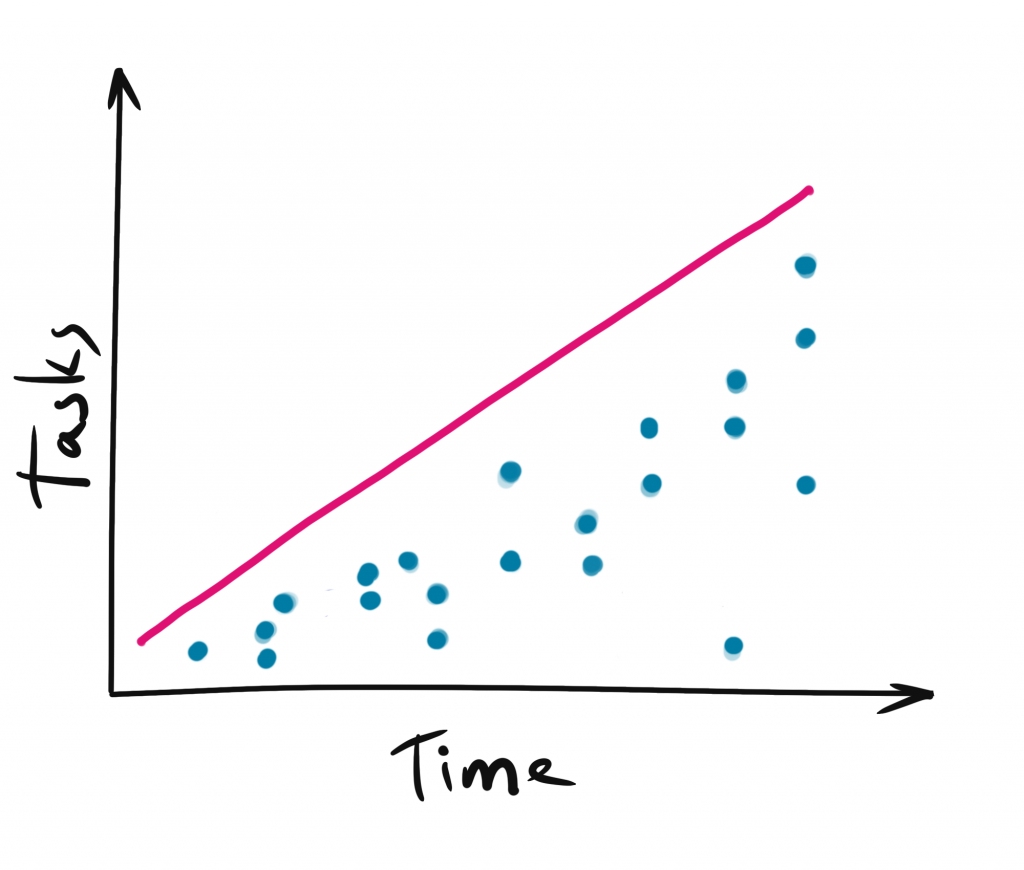
Another useful representation is Control Chart
Every dot is a separate completed task, where horizontally coordinate defines time when it was done and vertical coordinate represents how much time it took to finish it. This chart makes it possible to see anomalies in the workflow, bottlenecks, and potential solutions.
Below are some typical patterns you can recognise looking at your Control Chart:
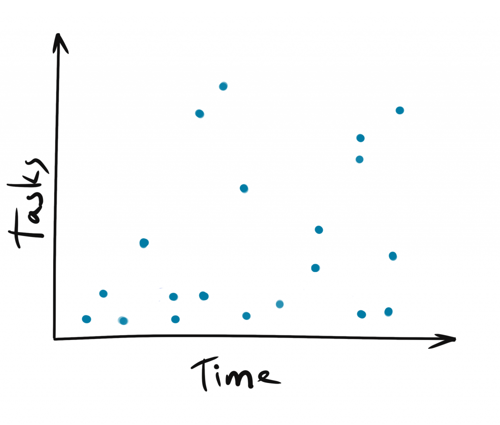
Below is an example of a Control Chart built from the list of tasks generated earlier in the text:
And here the true beauty of viewing work as a flow is revealed. Control Chart, shows the average time it takes to complete a task, the 75th percentile line, which separates the completion times of 75% of the tasks from the remaining tasks that took longer, and similarly the 95th percentile line. By looking at these lines, you can always estimate how long it usually takes to complete a task, and how much longer it might take with a 75% or 95% probability. In other words, by looking at this chart, a manager can easily assess the probability of how long the next task will take on average, as well as the worst-case scenario they should plan for with a 10%, 5%, or even 1% likelihood, relying not on people’s estimates, but on the project’s statistical data!
Okay, let’s say we know how long, on average, it takes the team to complete a task, along with the probabilities for different durations, but how do we figure out when the whole project will be finished? For this, we use a more advanced statistical tool: Monte Carlo simulation. It’s like a kind of “virtual time machine” that runs thousands of scenarios for when all tasks will be completed, based on the team’s actual historical throughput and cycle time. The result of this simulation is a statistical distribution of completion dates, which allows you to say, for example: based on the team’s historical data, there’s a 50% chance the work will be finished in two weeks, and a 99% chance it will be finished in a month.
To anyone who would like to dive deeper into the topic, I highly recommend the book Actionable Agile Metrics for Predictability by Daniel Vacanti, as well as the articles and excellent tools available at https://actionableagile.com/. To grasp the concept, it’s especially worth trying out The WIP Game which simulates the team’s planning and work process, giving you an understanding of how the ideas described above work and introducing you to some additional visualizations that I haven’t covered.
To me, the power and elegance of this method lies in the fact that all the information about each team member’s performance, as well as random factors like sick leave or vacations are already included in the statistical data. We don’t need to estimate each task separately, and the result is not a “magic date” for project completion, but rather a set of probabilities.